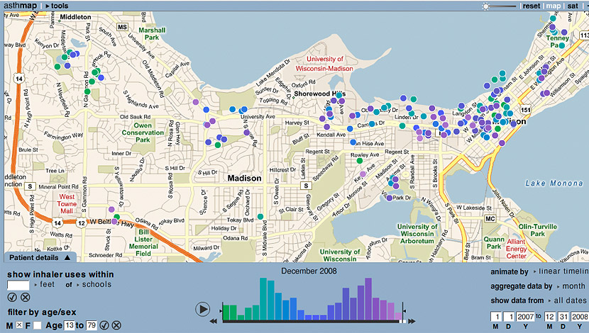
NationalIncidentMap.com has, using a mix of feeds and twitter posts from volunteers, created constantly updated maps, focused on several types of risk with a time-frame of the previous 24 hours. It’s not exhaustive, but it’s a good demonstration of what’s possible with crowdsourcing and aggregation. We’re not sure this could be comprehensive and complete without at least some full-time staff – but it’s still useful. There are also links to the same data in list form, and each incident market includes some data about the incident which it represents.
[imagebrowser id=108]
National Incident Map is also looking for more volunteers; their pitch, from their welcome page, appears below:


