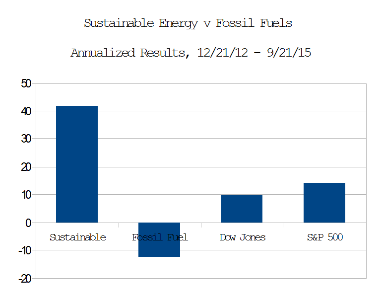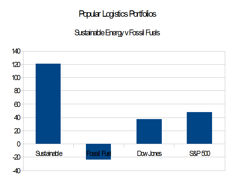
1. Four units of rope make a square, one unit on a side, and encompasses an area of 1 square unit.
Suppose you had a piece of rope. Your aim is to encompass as much area as possible. The rope doesn’t stretch or shrink, nor break no matter how hard it’s pulled – it’s good rope. Could be made out of cytoplastic nanotubes or something.
No matter if you measure your rope in inches, miles or centimeters. Just invent a fiat measure defined as one quarter of the length of the rope, then stake out a square. Each side is one unit and the square’s perimeter is four units. The square’s area is the square of a side: 1 unit × 1 unit = 1 unit2.
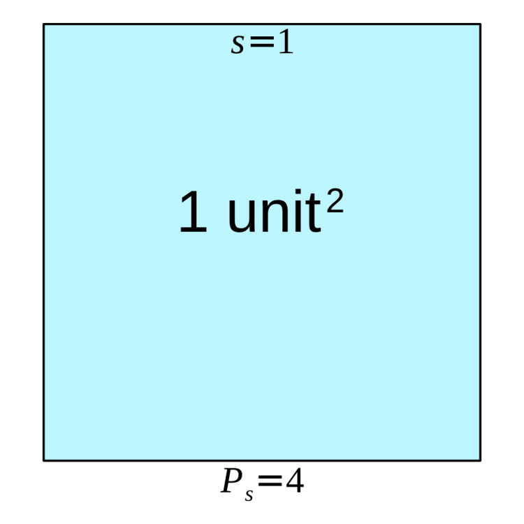
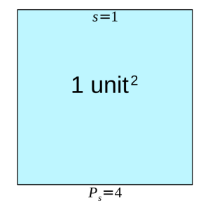
That’s all well and good, but are we encompassing the most area that we can with this rope? A regular octagon suggests otherwise:

2. Four units of rope also make a regular octagon, 1/2 unit to a side. In this case, the same amount of rope encloses 1.207 square units, a bit more than 1/5th additional area beyond that of a square.
For the same amount of rope, a regular octagon encompasses a little more than 1.20711 times the area encompassed by a square.
We arrived at this regular octagon by applying a modification rule to the square: we halved the sides, doubled their number and made all the interior angles the same. That gave us a polygon that encompassed more area than the square for the same perimeter, four units.
3. Four units of rope also make a regular hexadecagon, 1/4 unit to a side, with sixteen sides equalling four units of rope. In this case, the same amount of rope encloses 1.256 square units, a wee bit better than that of an octagon.
Halving the length of the sides yet again, increasing their number by two, gives rise to a hexadecagon which encompasses an even greater area: 1.256 square units surrounded by four units of rope, divided into 16 sides of one quarter unit each.
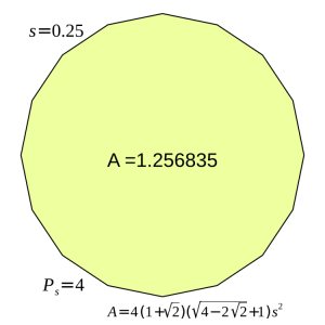
You can see where this goes – as the number of sides increase, the regular polygon more nearly approximates a circle. So, by the miracle of calculus, we magically increase the number of sides up through a regular myriagon (10,000 sides) past the regular apeirogon (an countable infinity of sides) arriving at the limit figure: the circle, which encompasses the largest possible area for a given perimeter: about 1.27324 square units for a rope four units long.
4. A circle with a radius of 2 over pi has a perimeter of four units and an area of 4 over pi, about 1.27324. Compare this to the unit square with a perimeter of the same length, but which only has an area of one unit square.
This is the essence of the Gerrymander Index (GI): any perimeter P of a given shape S that encompasses a particular area Ap, also encompasses a circle with the maximum possible area, Ac. The Gerrymander Index for that particular shape S with perimeter P is then:
[pmath size=12]GI_P = A_p/A_c[/pmath]
The Gerrymander Index is a computable property of a particular shape. It is a unitless measure arising from a ratio of areas and compares a shape’s area with that of the circle whose circumference equals the shape’s perimeter. When the shape is that circle, the Gerrymander Index is one, the ideal. Line segments, which do not have interior areas, have Gerrymander Indices of zero. All shapes that encompass some interior area, but are not circles, have Gerrymander Indices that fall somewhere between one (circle-like) and zero (line-like).
The Gerrymander Index is independent of size. The index compares the area of a shape relative to that of the circle with an equal perimeter, hence they “scale together.” We may compare Gerrymander Indices of huge, rural Congressional districts with block-sized urban districts without getting into apples-versus-oranges side debates on whether size matters.
To get a feel for this index, consider our unit square. It has a Gerrymander Index of 1.00000 (Ap) divided by 1.27324 (Ac): GIsquare = 0.785398. Most people would think of a square Congressional district as not being especially gerrymandered, so a GI of 0.7 – 0.8 can be considered “quite decent.”
The regular octagon with a perimeter of four units and area of 1.20711 square units has a Gerrymander index of 1.20711 divided by 1.27324, or 0.94806 – very nearly circular and probably too good to be seen much in the real world. The regular hexadecagon weighs in with a Gerrymander Index of 1.25684 ÷ 1.27324 = 0.98712 – a hair shy of a circle and too good to be true.
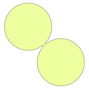
5. A tiny bridge connects two shapes with original GerryMander indices of about 0.98, but the index for the combined shape plummets to 0.507.
Conversely, we can combine a couple of shapes, each with a pretty good Gerrymander Index, into one that doesn’t have a particularly great index. The two circular regions in Illustration 5 on their own have Gerrymander Indices of 0.98. The tiny connection bridge linking them gives rise to an overall “dumb-bell” shape with a Gerrymander Index of just 0.507.
How does the Gerrymander Index fit in with the Great National Discourse, at least insofar as Congressional Districts are concerned?
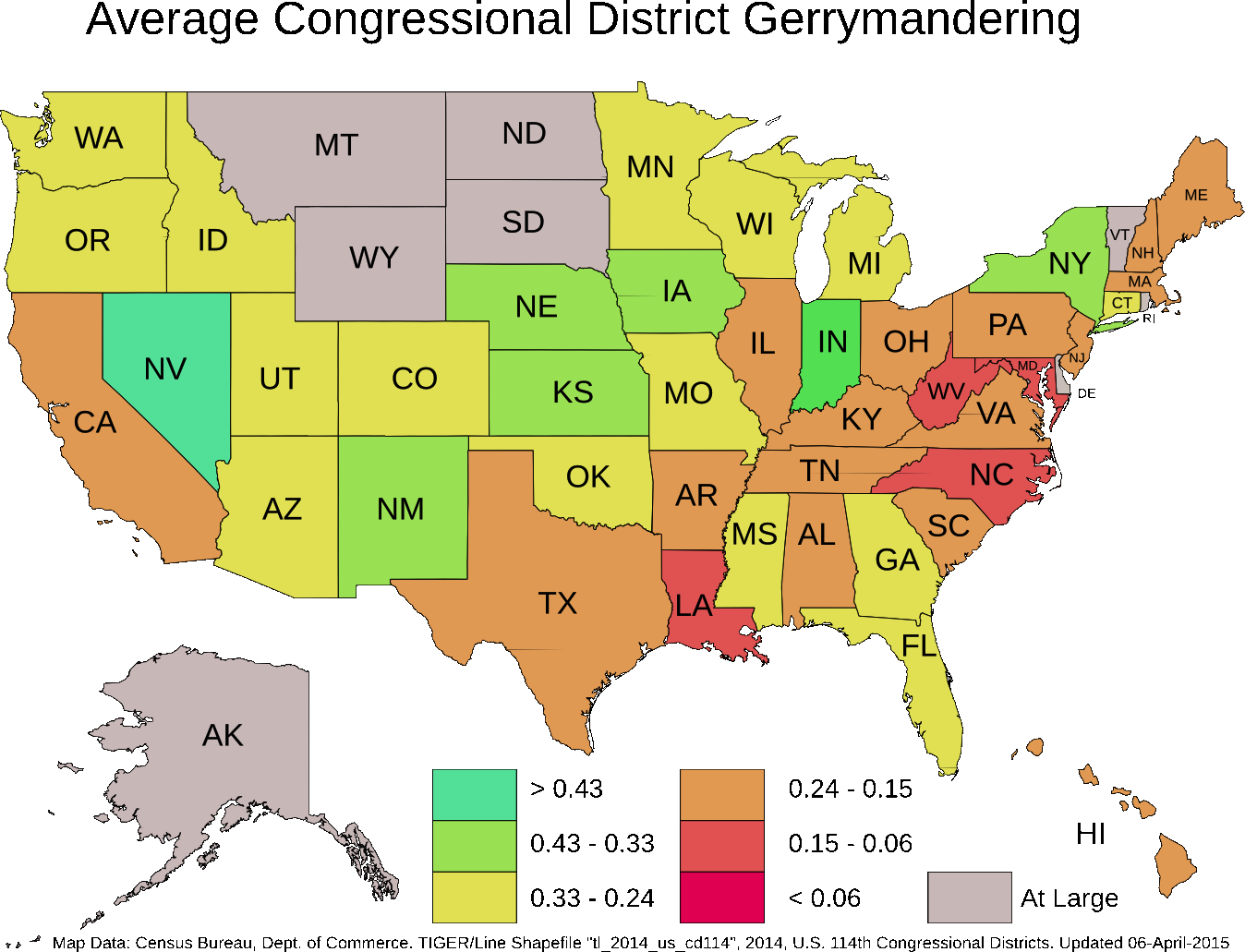
Justin Levitt, on the faculty of Loyola Law School in Los Angeles, furnishes us with a summary table of the criteria that various state level redistricting organizations follow. Thirty seven states include some sort of “compactness” guideline, but as Prof. Levitt points out, the precise meaning of “compactness” is often wanting, with definitions using language that the shape should be “regular” or that voters in a district should “live close together” or not be “far-flung.” This kind of language wanders around the concept of a numerical index, but doesn’t hit it on the head, leaving quite a bit of interpretive play. Different observers of a particular Congressional district may form different impressions of how “compact” that district is.
In contrast, the GI injects a hard number, one based solely on the geometry of a Congressional District. It enables us to discuss how much a particular district is like a circle. One is not obliged to consider the various political forces that caused a district to be shaped in a particular way. One only needs to apply a technique – taking a ratio of two areas, one that the perimeter encompasses, the other that a circle with an equivalent perimeter encompasses.
A hard number such as the Gerrymander Index allows us to consider particular thresholds. We might argue, for example, that any proposed district with a Gerrymander Index below 0.03 be disallowed as “too contorted”. Of course, that threshold is subject to debate and should be debated. We just wish to point out that at this juncture, the Gerrymander Index makes such a debate possible, as it is a concrete property of the shape.
Alternatively, we can set a threshold on the downward change in the Gerrymander Index from one re-districting effort to the next. Illustration 5 makes the point visually. Two districts with quite excellent GI’s of 0.98 are combined to produce a new district with a GI of 0.507, a downward plunge of 0.473. What if downward changes in GI were limited to a threshold of 0.2, while upward changes in any measure would be allowed? Such a policy would grandfather badly drawn districts initially, but over time, with significant GI drops disallowed, Congressional districts would all tend to compactness, with higher GI indices becoming the norm.
A word of caution is in order. The Gerrymander Index stems from the length of a shape’s perimeter. That comes from a map. To what precision is a map measured? The astute will now recognize that we teeter on the edge of the coastline paradox, attributed by Benoit Mandelbrot to mathematician Lewis Fry Richardson.
Two maps of the State of New York, each published by the U. S. government, illustrate the paradox.
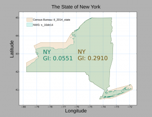
6. The State of New York as published by the Census Bureau (tan) in mapset “tl_2014_state” Overlaid in turquoise, the State of New York as published by the National Weather Service in “mapset s_16de14”. The inclusion of shoreline data causes the GI to plunge from 0.291 to 0.055.
The Census Bureau clearly documents that their maps are for display and illustration. They deliberately simplify coastlines along large bodies of water, though political borders are carefully drawn.
For our purposes, this illustration reminds us that we cannot talk or write about Gerrymander Indices in isolation. The index is absolutely keyed to the map from which it is calculated, and in honest debate, the source of maps must always be mentioned.
As remarked in our second technical note, we use the Census Bureau map sets because those are the ones from which Congressional Districts have been published. As it so happens, the pruning of complex coastlines usually put Congressional districts in a more favorable light. For example, the 1st Congressional District of New York, currently occupying the eastern third of Long Island, would be “naturally gerrymandered” by the North and South Forks, the tiny islands between the two, and the barrier islands running along the south shore. The simplifications applied in the Census Bureau maps omits those details from the map.
So long as we are clear that we ground our Gerrymander Index on this particular map set, and agree that Census Bureau modifications serve technical purposes only, there should be no cause for “apples v. oranges” debates. Though in the polarized atmospheres that encompass much 21st Century political discourse, such an agreement could be hard to obtain in practice.
Next and Last Part: Some of our favorite Gerrymanders.
Technical Note 1: Isoperimetric Index
The Gerrymander Index is not entirely original with this author. Dr. James Case presented a similar formulation in the SIAM Journal in 2007, and his sources trace the technique back to ancient Greece, so even Pythagoreans had some notion of a gerrymandering index.
Case reports on a unitless measure arising from a ratio of areas, but for the numerator he takes the area formed by the length of a shape’s perimeter, P2 and compares this with the area 4πAp, the denominator, with Ap equal to the area of the shape encompassed by P. If P happens to be circular, then the value P2 will equal 4πAp, the numerator and denominator have the same value and the ratio of the two areas becomes one. This arises from the relation that couples a circle’s circumference (perimeter) to its area: A =πr2; P = 2πr; P2 = 4π2r2; P2 = 4π(πr2); P2 = 4πA. Thus, the ideal in Dr. Case’s “isoperimetric index” is identical to the Gerrymander Index: unity.
The usual non-circular case may be reached by holding Ap constant and pulling, pushing and twisting the perimeter P out of round so that it grows in length, encompassing the fixed area Ap less and less efficiently. It becomes more contorted and “longer,” leaving P2 > 4πA, the isoperimetric index exceeding one.
The isoperimetric index behaves somewhat like the inverse of the Gerrymander Index, reporting divergence from the circular ideal with ever-larger numbers. This is a technical difference. Conceptually, it too is a hard number and enters into the Great Discourse the same way that the Gerrymander Index does: injecting numeric precision into a debate that suffers from fuzziness.
Technical Note 2: The Area of Arbitrary-Shaped Closed Polygons
Few shapes in the real world, Congressional Districts included, come with neat formulae that give exact areas; the world is fractal. So how does one deal with the realities of Illinois Congressional District #4?
Computational geometry gives us one method that does not constrain us too much, so long as we limit ourselves to closed polygons with sides only consisting of line segments and which do not self-intersect. That is, our polygon lays “flat” on a surface without any part of it folding over any other part. When the shape does not self-intersect, it may be stretched topologically into a circle. If reshaping entails one or more holes, like a doughnut, then the shape has intersected itself. Barring that, and with only line segments for sides, a shape may be otherwise arbitrarily convoluted.
This is the kernel operation. It produces an area fragment, Aj: , corresponding to adjacent vertices (xj, yj) and (xj+1, yj+1):
[pmath]({x_j}{y_{j+1}} – {y_j}{x_{j+1}})/2[/pmath]
The kernel operation works on pairs of adjacent vertices, j and j+1. We start with vertex zero and one, apply the kernel operation, go on to vertex one and two, apply the kernel operation, and so on, until we come to the final pair, which is the very last vertex paired with the very first. We add up the area fragments and take the absolute value of the sum. This gives us the area of the arbitrary polygon. The absolute value operation disguises the fact that walking counterclockwise around a polygon calculates a negative area. This may unsettle the casual reader. Negative areas have their uses but we’ll put such aside and just take the absolute value of the numerator.
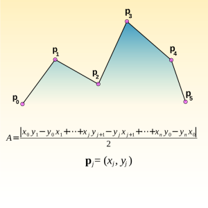
6. The area of an arbitrary polygon arises from a sum of “area fragments”, each composed from pairs of adjacent vertices.
Usually, polygonal datasets for congressional districts consist of thousands to tens of thousands of vertices, making this effort a bit tedious for paper-and-pencil work. That’s what computers are for.
Where do we get our data? The U. S. Census Bureau furnishes data on the shapes of 2013 Congressional districts in the form of Esri Shapefiles, which meet these criteria and are available to the public from the Census Bureau product page. With the exception of Minnesota, these shapefiles also describe the districts for the current 114th Congress. These files come in different resolutions to serve varying display purposes. TIGER® (Topologically Integrated Geographic Encoding and Referencing)/Line shapefiles are for high resolution work; they can get quite large. Cartographic Boundary shapefiles are light-weight, low-resolution versions of the Line files: quick to down-load, easy to render, but furnish only somewhat coarse approximations of a political boundary. We use the TIGER/Line files for Gerrymander Index computations.
What do we do with our data? Get a shapefile reader, which come in a variety of shapes and sizes, and do a bit of scripting for the Gerrymander math. For this series, we use the Python scripting language to do our math and Joel Howland’s pyshp module to interface with Esri Shapefiles. This is a lightweight approach for those accustomed to scripting. It’s how we made our pictures, too.
For those who just want to load and visualize, one needs GIS software. These too come in a variety of shapes and sizes, but none, at the moment, give readings on either isoperimetric or Gerrymander indices. High-end jobs like GRASS can take add-ons written in a variety of languages, so one could, in principle, add a Gerrymander Index calculator. GRASS is a world unto itself, however, so we didn’t go that route, wishing to finish this post before the century closed. There are also online communities centered on web-based geodata. Google Maps is the best known, and lets users integrate Shapefiles. Injecting custom calculators into the mix do not seem possible at the moment, but there is always the future.
Further Reading
-
“James Case “Flagrant Gerrymandering: Help from the Isoperimetric Theorem?”” SIAM News, Volume 4 Number 9, November 2007
-
H. R. 1347 (114th Congress, 2015-2017) John Tanner Fairness and Independence in Redistricting Act
-
Justin Levitt All About Redistricting “Where are the lines drawn?”
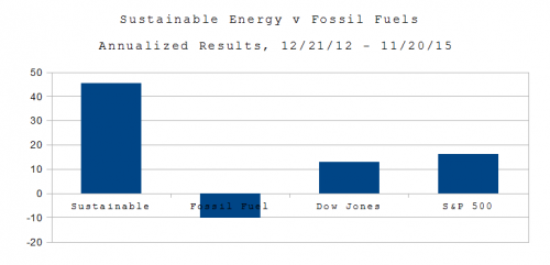
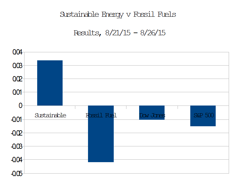
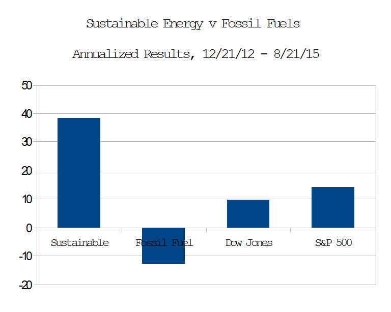
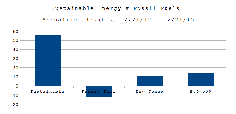 On Dec. 21, 2012, I put $16 Million imaginary dollars in equal imaginary investments in 16 real energy companies; $8.0 in the Sustainable Energy space and $8.0 in the fossil fuel space. Excluding the value of dividends and transaction costs, but including the bankruptcy or crash of three companies in the sustainable energy space.
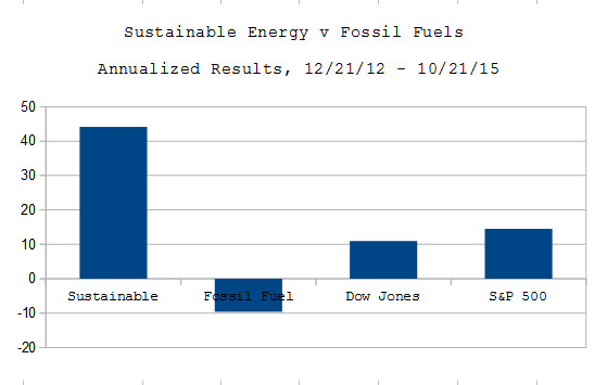